Studio Calico "Savannah" February documenter kit

Hi, everyone! Thanks for coming back for another review/unboxing! This time I'm looking at the February Studio Calico documenter kit, Savannah. The photo above is from the Studio Calico website. Keep reading for my thoughts! Spoiler alert, I did not love all of it!*
This kit comes with 30 cards. 5 are 4x6 and 25 are 3x4. The color theme of this month is peach/pink with yellow and some gold. Pink and peach are definitely not my favorite and there are a few cards I don't think I could see myself using. For example, there is a 4x6 card with red gingham. It's such a "country" feel and I would never use that! If gingham is a new trend, I'll be pretty bummed! Looking at the photos on the website, I have to say I liked the b-side cards better than what is shown. Here are a few of my favorites from this month. I love trendy touches like emojis! You can't always trust the website picture to give you a perfect idea of what you get and, in this case, I was pleasantly surprised.

The kit also contains this 4x6 gold vellum card/paper. Again, i'm not crazy about gold and I have a Heidi Swapp value kit that I never use, so this is right in line with that. On the other hand, white and gold is a versatile combo, so it'll probably find a home in my book.

The kit also contains these Twine + Ink acrylic dots. I love these and I feel like this is something I would normally hoard, so I'll make an effort to use them all up!

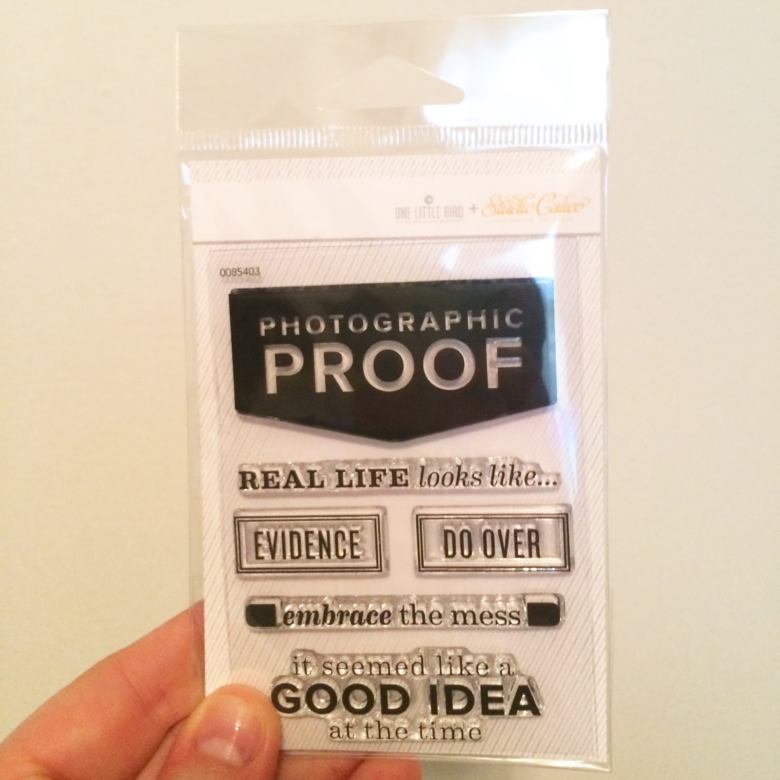
I'm grateful the kit contains these grey word/phrase stickers. I feel like this will help tone down the incessant pinkiness of this kit and give it a little bit of a modern edge.

These peach letter stickers are also included...

...as are these pink and peach hearts. These coordinate well with the kit but that's about all I can say about these things.

Now, this is interesting. These pieces are included in the kit. Again, I don't love the peach. But putting that aside, this is what I expect from Studio Calico and why I have a subscription there! These are new and interesting! I'm not quite sure how to use them on my pages, but that's a challenge and it's stuff like this that keeps me interested in Project Life! So, great idea, SC! Thanks for thinking outside of the box on my behalf so I don't have to!

I'm really digging this stamp. I mentioned in my Citrus Twist February kit review/unboxing a few days ago that I am looking for bolder, bigger stamps. This fits the bill! It's big enough to be an element on its own that can add color and interest, just like a paper element would. I also bought some pigment inks during the bundling period, so I'm looking forward to working some more color in via these stamps.
Liking these wood veneer hearts. I think I saw a CT member use them for a shaker pocket, which was a cute idea! I do't want hearts every month, but I like wood veneer a lot, so I'll take it.

Ah, rubber pieces! I like the texture a lot! We had a choice this month between "yep" and "nope." I'm trying to be a more positive person so I was inclined to go with "yep," but "yep" is not right. It's "yup." "Yep" sounds like a bird call. It just didn't make sense to me! Anyways, there's some scandal brewing about rubber pieces melting glue dots, so look into it and be careful how you attach these guys to your projects!

Here are all the pieces laid out on my desk. I really think you get a little (or a lot) less with studio Calico than with Citrus Twist, for about the same price, taking shipping into account.

All in all, I don't think it's a secret I wasn't in love with this kit. It's too soft and pastel-y. I keep up with Studio Calico because I want the trendiest, edgiest products the scrapbook world has to offer, and if red gingham is the best the market has to offer, then I don't want to know what the future holds! I am no longer under my subscription and I'm month to month with Studio Calico now and I've considered cancelling. But I happened to see a CT member post a sneak of March's kit and it had some green, so I'm going to hold on hope that next month's will be more my style.
*I hope you don't think I'm a hater. I'm trying to be honest, but also nice. If this is your style, I don't mean to hate on it. But we all try to express ourselves with our scrapbooks and this kit just doesn't speak to me. I know SC can't please everyone all of the time! I just don't feel like this kit fits with their general edgy and hip aesthetic that I signed up for in the first place. Even if you don't agree with me, I hope you got some information just from seeing up close what comes in this kit.
I was going to work on a post talking about how these kits work together, but I am behind and super busy, so I'm not going to try to mix Citrus Twist and Studio Calico this month. I might even try to scraplift whole pages to keep from getting too bogged down but still come out with a result I enjoy. Maybe March will be a better opportunity for that, if you would be interested.
Thanks for reading and I hope some of this has been helpful and informative!
**Edited: I previously called this kit "Arendal," which is not correct. I've changed the post to reflect that the name of the kit is "Savannah." Apologies!
Comments
Post a Comment